

This week I am trying something a little different. In lieu of a post on theoretical or cultural questions poised by some technological innovation or another, I wrote up a short introduction to open source sentiment analysis software, a post meant for complete beginners. I am currently experimenting with a biweekly (twice a week) posting schedule alternating long and short posts. We’ll see if this is the most efficient set up!
While I am aware of the many, many, MANY different tools out there (see Oxford LibGuides Text Analysis Tools), I limit myself to these four for the sake of brevity. The four are: Hedonometer, Story Lab, Socialmention, and Tweet Sentiment Visualization. Though elementary, these platforms are good starting points for those who have never done any sentiment analysis or basic data mining before, as they require no computer skills except the ability to type and do not required download. I hope to provide a more sophisticated tutorial at some point in the future. I do not have time to go over what sentiment analysis “is,” so I suggest familiarizing yourself with the concept if necessary.
Tips: Software Advice is a technology blog aimed at a “beginner” technology audience. I have found it useful for explaining technical terms in accessible language. They have an excellent blog post that demonstrates how visualization is always rhetorical by going over the strengths and weaknesses of six different kinds of graph designs in order to help you choose the right graph to communicate the data effectively to your audience.
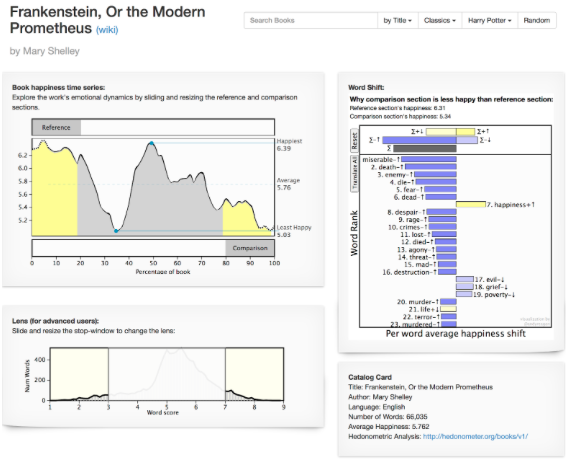
Hedonometer analyzes “positivity factors” across texts such as novels, press releases, papers, etc. Very easy to explore. Sometimes, it is easy to download the supporting data from an article. Go to “Journal link” and see if there is an option for downloading data as “Figures and SI” or as another format (Excel or arXiv). Other times, it is difficult to figure out how to get information if Hedonometer’s arXiv links aren’t working. There can also be an option to download data in more interactive publications. You may have to click around. The most labor intensive and annoying way to find data sets in the social sciences articles is to read the article and look at the tables in the methodology. You may have to click around to see if the option to download the table exists. The methodology and data used by the website can be found here.
Storylab:
UMV’s Storylab is worth exploring because it offers many examples of how data and sentiment can work, including comparative multilingual analysis. They provide their general methodology and focus here.
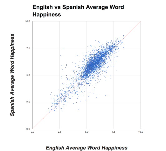
The website also provides the data sources used in the project (social media, individual texts, movies and TV, etc.) here. It can show you the frequency of specific words for language. I include this resource not for the reader to visualize their own data, but to practice checking and filtering data by other people and downloading material in different formats. The best way to use Storylab is to click between different tabs to see various research projects undertaken by the team. Then, you can decide which projects you want to look at more closely and which data to download for your own experimentation with data visualization software (which I shall cover in a different post).
With UMV, if you want to download to provide examinations of your own texts, you can download their code at Github. This option requires more expertise and familiarity with Github.
Socialmention:
Socialmention tracks trending topics across different search results, websites, and social media on the internet to provide basic analysis of the sentiment expressed as “positive” “neutral” or “negative. You begin by searching a topic. The site will then offer trending terms. After you search a trending topic, you should see an interface like this:
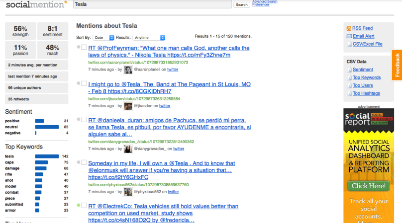
(Apologies for the quality — this was the only screenshot I could get that fit in the entire interface. Don’t worry about reading the words now. I want to go over the interface).
For this example, I chose the trending term “Tesla.” The middle column provides the data that Socialmention found mentioning the “Tesla.” Notice that if you are searching for the car Tesla, be careful to check for results about the inventor Nikolai Tesla.
The column on the far left side provides the analysis. It estimates the general sentiment of the topic. It notes the most common keywords, the top “users” discussing the subject, the top hashtags (in this case, only one), recent updates, and sources.
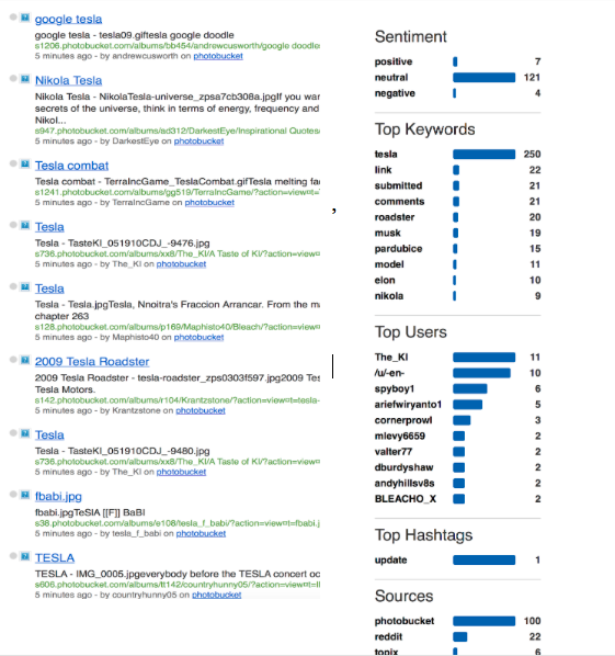
To download the data on the left side column, go the gray box in the upper right corner .

You can download the entire set as an CSV or Excel file. If you wish to download only part of the set — Sentiment, Top Keywords, Top Users, Top Hashtags — click on the appropriate tab to download the information as a file.
TweetViz
This app is self-explanatory. It analyzes sample sets of recent Tweets with any hashtag or subject of your choice for “tone” on a spectrum on two scales: 1) of unpleasant to pleasant” @) “intensity” of the Tweet (active or subdued) ” or “excited” versus “unpleasant.
Type in the term you want to search to find the current “tone” of tweets about your topic For the purpose of this example, I chose “Beto.”
(note: figure not to scale)
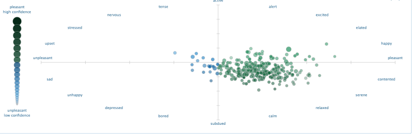
In the upper righthand corner of the graph, just below the blue bar, you shall see the number of Tweets that TweetViz is using as a sample. On the left side of the graph, you can see the Pleasant-High Confidence – Unpleasant-Low Confidence that TweetViz evaluates upon. If you scroll down below the search bar, you will find a more detailed methodology and description of how the search tool works.
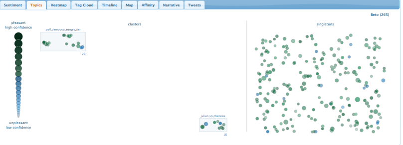
The tool bar is self-explanatory. The second tab, “Topic,” visualizes “topic clusters:” other subjects frequently mentioned in the same tweets in the sample tweet set.
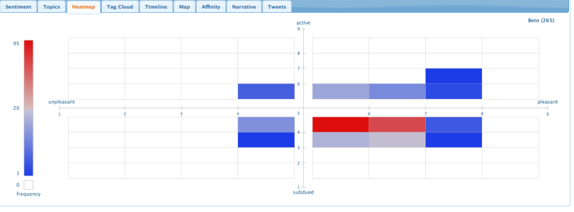
Under the “Heatmap” tab, you can block out general trends in a bar graph. This graph provides numbers that can be easier to understand than the scatterplot graph.
You can use the “Tag Cloud” tag to determine the most common tagged terms alongside your search subject within specific Tweet groups identified as “ actively unpleasant (towards subject),” “passively (subdued) unpleasant,” “actively pleasant,” or “passively pleasant.”
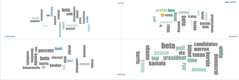
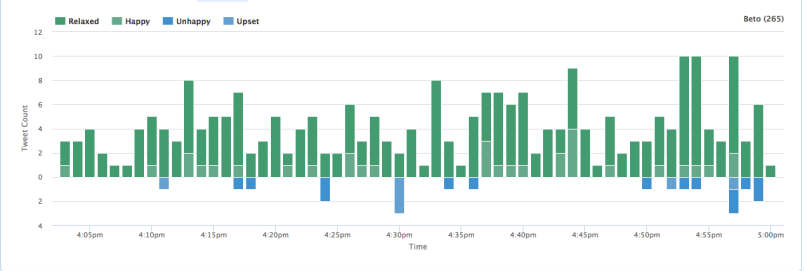
You can follow timeline of the frequency of tweets (and their sentiment) over a period of time. (For this example, I chose every two minutes over a specific day (09/28/2018). I recommend choosing a narrow time frame for the most precise data if you are using a hashtag that has been trending for several days or weeks.
Under the “Affinity” tab, you can also search for the most common hashtags that appear in Tweets mentioning your subject. This network graph also shows the users who are most addressed by handle, or “@’d,” in these Tweets. This is different than the topic clustering feature, which shows specific words and topics mentioned in a tweet whether or not the words are hashtag’d. The Affinity feature shows users who are directly addressed (@BetoORourke, @Breitbart News etc) and popular hashtags in the sample tweets. This search on 12/12/18 shows the only noticeable repeating hashtag is #beto. Prior to the November 6th election, there were other tags such as BetoForTexas and ChooseCruz.

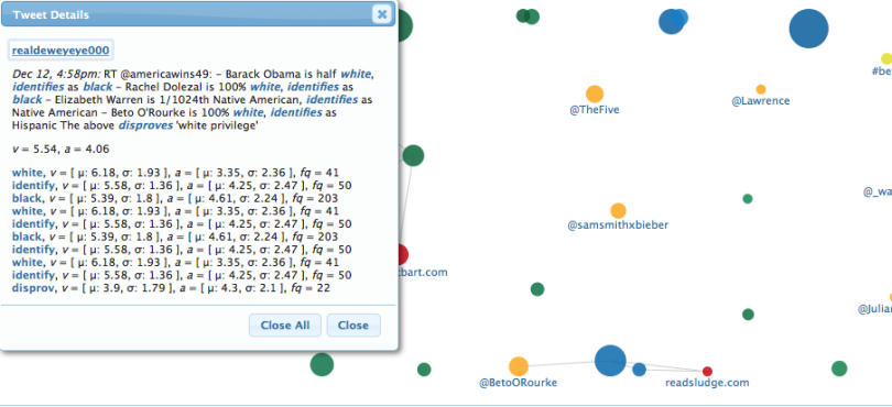
If you want to closely examine a specific tweet, you can click on the “dot” representing the tweet. You will see both the text of the tweet and the way the software coded specific words:
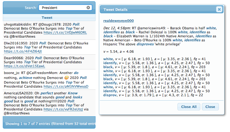
Finally, under “Narrative,” you can do a specialized search for tweets within the subject you’ve mentioned. I recommend using this feature if you are trying to isolate tweets from a particular news source or with a particular topic that is not included within the topic cluster graph. In this case, I searched for the word “President,” which was only found in 7 out of the 32 representative samples.
For the truly brave at heart, you can click on “tweets” to personally read the all the tweets that TweetViz analyzed as a sample. Don’t say I didn’t warn you. The words tagged by the software to measure active/subdued and positive/negative are highlighted.
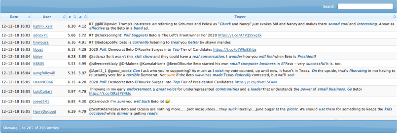
You can use the search bar on the upper to find specific terms in the Tweets.
Conclusion:
These four tools provide examples of different ways to approach sentiment analysis. From comparative text analysis, to data mining Twitter or internet search results, to downloading data from pre-existing work on sentiment analysis, these tools are worth exploring in preparation for more difficult software.
